UCLA DGSOM Logo
Logo Requirements
Logo Color
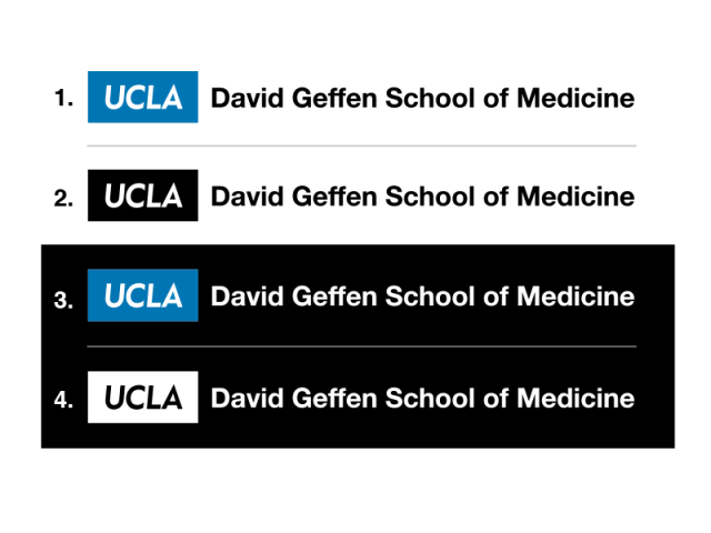
Department logos typically appear in combinations of UCLA Blue and black, as shown here in the UCLA DGSOM logo. All black and all white department logos are also acceptable. Never use the department logo in gray or grayscale.
The boxed version of the UCLA DGSOM logo can be:
- UCLA Blue and black on white background
- All black on white background
- UCLA Blue and white on black or dark background
- All white on black or dark background
Always use the logo artwork from the brand bundle provided by the DGSOM Dean’s Office, or UCLA Health Marketing (at the bottom of this page.)

Minimum Clear Space
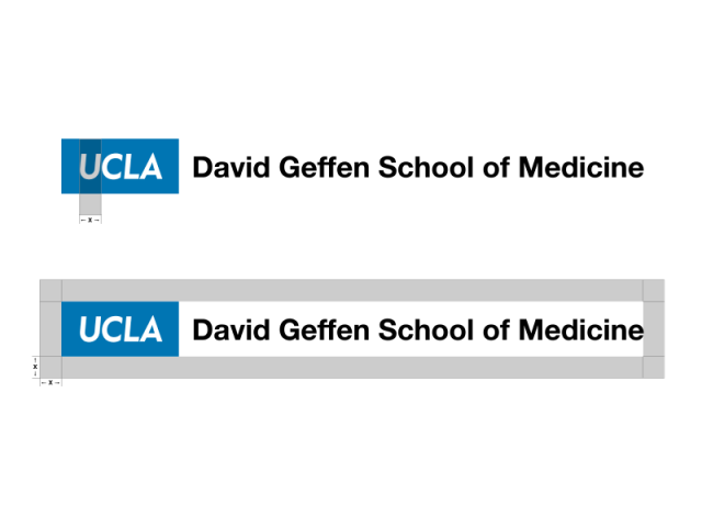
Never crowd department logos. They need “buffer” space to achieve visual impact. Use the width of the letter “U” to gauge the amount of clear space that’s needed.
It’s fine to align the left hand edge of the logo with your text or image. The empty space in the margin will function as the necessary clear space.

Minimum Size
Never use department logos below the minimum size, measured vertically. The logo should be at least 0.4” high, equivalent to 34 pixels high.

Download UCLA DGSOM Logo
By downloading artwork, I agree to use the UCLA DGSOM Logo(s) only as specified in Policy 110 and this Brand Guidelines site.