UCLA Health Logo
Registered trademark
UCLA Health is a registered trademark. State, federal and international law protect UCLA Health’s trademarks.
The employees of UCLA Health have a right (and responsibility) to use the UCLA Health marks on the print, video and online materials they create to conduct the business of the health system, but they must do so properly. We recommend using an ® with the UCLA Health logo either upon first usage, in the most prominent location, or both.
Third parties cannot use the UCLA Health trademark without first obtaining written permission from the trademark owner and must otherwise comply with our brand protection policies: , and .
Logo color
The UCLA Health logo may only appear in three color options:
- Blue, White and Black: White letters reversed out of UCLA Blue box; Health in black.
- Black and White: White letters reversed out of a black box; Health in black
- All White: UCLA letters reversed out of a white box, and Health in white. (For dark backgrounds only.)
Always use the logo artwork from the Download link to assure logo colors are correct. The colors were meticulously assigned to create continuity and consistency.


Download UCLA Health logos
By downloading artwork, I agree to use the UCLA Health Logo(s) only as specified in Policy 110 and this Brand Guidelines site.
The core element in UCLA Health’s graphic identity is the Campus Logo. The logotype is simple and modern, with a slight slant to “UCLA” to give it a dynamic feel. It’s a custom font design and can’t be accurately reproduced with any typeface.
The “boxed” logo offers impressive visual weight and puts the UCLA Blue color front and center.
Placement
Take care in positioning the UCLA Health logo. Choose the minimum size or larger, and provide at least the minimum clear space around the logo. Typically booklets, brochures and reports use the logo on the front or back covers. Flyers and ads often use the logo near the bottom to anchor the layout.
Only rarely is the UCLA Health logo the focal point of a layout. A photograph, headline or title may well be larger or carry more visual weight. However, the logo does need prominent placement and proportional size so it doesn’t disappear from the page. This is especially true for first time and prominent use of the logo with the registered trademark.
Never use the logo in place of text in headlines or copy. When the UCLA Health name appears within a headline or body copy, simply set the letters UCLA Health in the same typeface and size as the surrounding text.

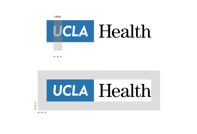
Minimum clear space
Never crowd the logo. It needs clear space, “buffer” space, around it. Use the width of the letter “U” to gauge the amount of clear space that’s needed.
It’s fine to align the left-hand edge of the logo with your text or image: the empty space in the margin will function as the necessary clear space.
The department logo system allows for tighter integration of the UCLA Health logo and the specialty or department name.

Logo size should be proportional to other elements of the layout. In no case should the logo be sized below these minimums, measured vertically.
Print: do not use smaller than 0.5” wide. Digital: do not use smaller than 36 pixels wide at 72 dpi or 0.5” wide regardless of resolution.
